Picking the Perfect Color Scheme
If you are new to color and the psychology behind it, you’re not alone. Color plays a large role in helping users navigate through an interface. By setting ground rules, you help aid and influence, visual hierarchy of tasks. And through trial and error, I was able to use these rules to successfully build a color library for my company’s new application.
Before you get into the hex codes,
you must develop an understanding of who you’re building the color scheme for. Knowing your users and considering their personas goes a long way in developing a proper color scheme for your application. As you begin, remember humans are creatures of habit and like to see visual patterns. Following nature’s color palette (i.e. gradients of conditions you see in nature) helps to select certain representations. The model I follow is the 60-30-10 rule. This is an excellent formula adapted from the interior design and fashion industries and works well in web design.
For example, in nature a fire is represented by colors such as reds, oranges, and yellows, and in a color library you will often find error messaging and other alerts in such colors.
With that being said,
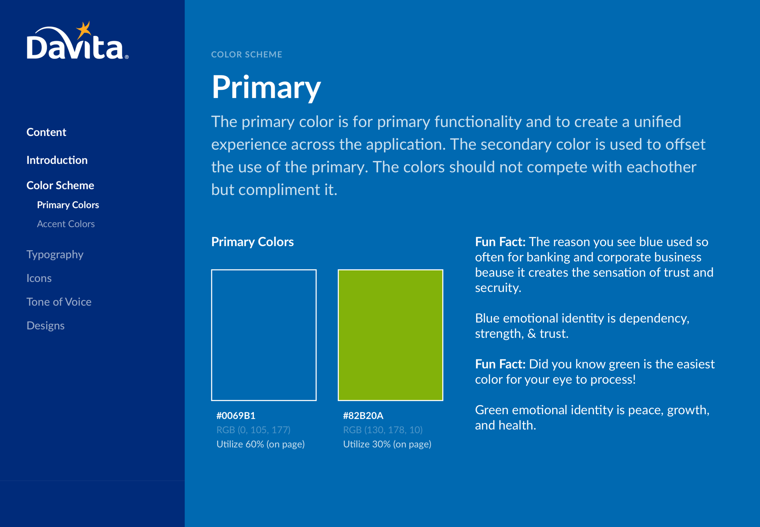
your primary color often goes hand and hand with your brand color. This color represents your “prime” functionality. Typically, most of the system’s interface components share attributes correlating to this color. This creates a unified experience. Remember personas? Make sure when choosing this color, you are sending the correct message on what this product characterizes.
Pro-tip: since the primary color is used a majority of the time make sure it accedes web accessibility on brightness and readability.
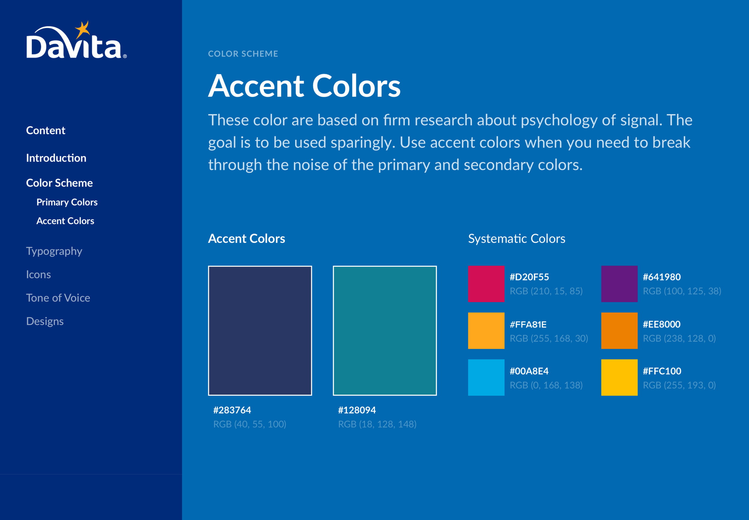
A secondary color should be used for lower priority actions, like filtering or sorting. This color should always complement the primary color and be utilized to offset secondary user flows. Lastly, you should develop your accent colors. These accent colors serve as data visuals and/or systematic handling. The goal of accent colors is to be used sparingly and to be bold enough to break through the noise of your primary and secondary colors. Therefore, the color(s) you choose, should counter or oppose the other colors in the palette.
At this point in time,
you should have defined your color types. Now, it is time to check your work. Web accessibility is a growing need, because as technology matures, so does the user base. Testing in grayscale and foreground/background contrasting ratios are some of my best practices. What helps, is printing screens in black and white to check the elements. Harmonies is also an important aspect when it comes to the balance of your color scheme. There has been numerous research on the pairings inside a color wheel. These patterns fall into categorizations, such as; monochromatic, analogous, and complementary harmonies.
Putting it all together.
Colorcom released a study that states, “only 90 seconds for people to make a subconscious judgment about a product and between 62% and 90% of that assessment is based on color alone.” Don't be scared of the statistic! The amount of research available nowadays makes it fairly easy to choose a color scheme. The challenge is, keeping it consistent in your interface.
So be aware and always remember while using these tips are beneficial, knowing your user always outweighs the aesthetics.
An example to the pattern library I built (below)